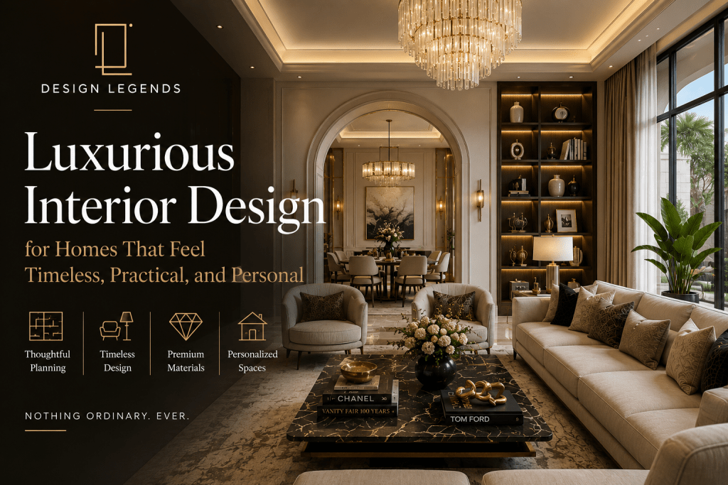
Introduction
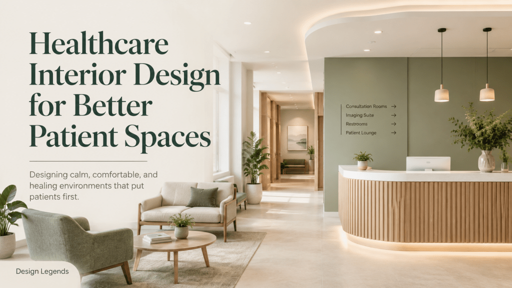
Healthcare interior design isn’t only about making hospitals, clinics, and wellness spaces look spotless or premium. It is more like building up environments where patients feel a bit calmer, doctors work better, staff movement goes smoother, and every corner supports care delivery with clear intent.
In healthcare projects, design decisions carry more weight than many regular commercial interiors. A wrong layout can mess with the flow. Poor lighting can create quiet discomfort, even when the room looks “fine”. Bad material choices can add maintenance headaches over time. Weak privacy planning can reduce patient confidence. That’s why medical spaces really need a design mindset that is functional, hygienic, emotionally tuned, and operationally solid.
Design Legends approaches healthcare spaces with a similar level of clarity you’d expect from high-end architecture and interior planning. First you decode what the space is meant to do, then you build around movement, comfort, workflow, privacy, and long-term performance.
A healthcare environment should not feel cold, confusing, or stressful. It should feel ordered, reassuring, and easy to find your way in.
Why Healthcare Spaces Need Better Interior Planning
Healthcare spaces serve multiple people at the same time, and somehow everyone ends up in the same workflow. Patients, doctors, nurses, attendants, administrative staff, and housekeeping teams, plus visitors, all interact with the same place, but in different ways, like each one has its own little rhythm.
A clinic might look really impressive from the outside or even on the first glance; however, if the reception desk gets backed up, the waiting room feels stressful, or the consultation rooms don’t give enough privacy, then the whole idea falls short at the user experience level. It can look fine, but it won’t work.
So that’s where healthcare interior design turns into a real deal. Good planning basically helps you settle key matters before execution even starts:
How will patients come in and get orientated?
Where will they rest and wait, without chaos?
How will staff circulate without interrupting visitors?
Can doctors reach essential areas quickly?
Will the consultation feel sheltered and private?
Are hygiene zones arranged in a clear and sensible way?
Is the lighting comfortable for both working moments and lingering waiting?
Will the environment stay easy to care for over months and years?
These aren’t “just decoration” questions. They’re the core design calls, the ones that decide whether the space actually supports care or not.
Design Begins With Patient Experience
For any healthcare project the patient journey should be the starting point, like, actually. From the moment a patient enters, the space should reduce confusion, not just a little but enough. The reception should be visible; waiting should feel comfortable. The signage should be clear, and the consultation route should be simple; movement should not feel chaotic at all.
Patients often step into medical spaces with stress, discomfort, or uncertainty; it is very common. A well-designed interior can reduce some of that pressure by using calm colours, softer lighting, clear circulation, comfortable seating, and thoughtful zoning. Somehow it just helps the mind slow down a bit.
This does not mean the space has to look overly soft or decorative. It simply means the design must support emotional comfort.
Design Legends is focused on creating spaces that feel calm without losing professional seriousness. In healthcare interiors, that balance matters a lot.
Reception Areas Should Build Trust
The reception is kind of like the first credibility point in a healthcare space. It kind of tells the visitor right away if the clinic, hospital, or wellness centre is organised and professional. If the reception setup is weak, it can cause crowding, mixed-up feelings, and, yes, that first impression slips away. A stronger reception area needs a desk position that’s easy to spot, waiting visibility that actually works, queue movement that stays controlled and calm, plus information points that people can reach without stress.
Also, the reception should not feel like a barrier; it should feel more like a guidance point. The materials used there need to be durable, simple to clean, and visually matched with the healthcare provider’s brand identity. For premium clinics or specialised medical centres, the reception basically turns into a trust-building zone too.
Overall the design should communicate care, not show off.
Waiting Areas Need More Attention
Waiting areas are often treated like leftover spaces or filler zones, but they really affect how a patient feels the whole time. A patient might end up spending more time waiting than actually consulting, so in a way that waiting area becomes one of the biggest parts of the experience.
A good waiting area design has to think about seating comfort, spacing, lighting, acoustics, privacy, and the flow of movement. The chairs should not be packed too tightly, not even a little, and the layout should let attendants and elderly patients move without hassle. Lighting also shouldn’t feel harsh or sharp; it should feel kind of calm. The materials should be simple to maintain and keep clean.
In paediatric clinics, dental clinics, diagnostic centres, and speciality healthcare spaces the waiting area may need different “levels” of comfort, zoning, and visual softness.
This is where healthcare interior design steps in, helping create a better environment, yet without compromising function.
Consultation Rooms Must Balance Privacy and Efficiency
Consultation rooms are basically the heart of most healthcare interiors. These spaces have to help with conversation, checking the patient, documentation, and that quiet kind of patient reassurance, the sort that calms people down.
Privacy is kind of non-negotiable. The patient should not feel exposed, rushed, or like someone can overhear them. But, at the same time, the doctor still needs quick access to storage, tools, screens, handwash areas, and the exam zones where it matters.
Furniture placement has to keep the conversation feeling natural. So the doctor’s table, patient seating, the examination bed, and the storage shouldn’t cause this awkward shuffle and extra movement every few minutes.
Lighting is also important; it should back clinical clarity and patient comfort too. If the room has too much harsh white light, it can feel stressful. If there’s too little light, then using the space professionally becomes harder.
Design Legends tends to see consultation rooms as practical environments first, then gradually adds the right amount of design polish afterward.
Hygiene Is a Design Priority
In healthcare spaces, hygiene is not only kept going by cleaning. It’s also backed up by the way the place is designed, kind of like quietly, in the background. Material choice has a big say in this. Surfaces should be sturdy, easy to wash, and made for routine scrubbing. Flooring should be low effort to care for. Wall finishes need to resist scuffing and wear. Countertops ought to support daily hygiene routines. Storage should keep things from becoming a mess – less clutter, more order.
Choosing the wrong material can seem fine at first, but it tends to give up fast once there is heavy traffic and constant scrubbing. Healthcare builds really need finishes that can deal with footfall, cleaning chemicals, equipment movement, and the everyday operational strain. That matters a lot for clinics, diagnostic labs, dental clinics, physiotherapy centres, wellness spaces, and even small hospitals.
And honestly, a gorgeous healthcare interior that’s hard to clean is more than just inconvenient; it becomes a liability.
Lighting Can Change the Entire Experience
Lighting in healthcare interiors really needs that level of precision you can’t improvise with. Different parts of the building end up calling for different lighting decisions, not just “more brightness”. The reception and waiting zones should feel warm and inviting, like comfort in a physical form. Consultation rooms often require clarity so people can actually see and talk properly. Procedure rooms tend to need task lighting that’s sharp and practical. Corridors should support safe navigation, including steady visibility at the right height. Then pharmacy and billing areas; they usually need functional brightness, straightforwardness and evenness.
Using the same harsh light everywhere is one of the most common mistakes, sadly. It flattens everything, makes spaces feel cold, and can even stress people out.
A better approach is layered lighting, where ambient lighting, task lighting, indirect lighting, and focused lighting are planned based on what each area is supposed to do. Not only for the eye, but for the whole flow of the day. In premium medical spaces, lighting also affects trust. A well-lit environment feels more organised, more considered, and more professional… even before anyone says a word.
So healthcare interior design should never treat lighting as an afterthought.
Colour Psychology Matters, But It Should Not Be Overdone
Healthcare interiors don’t have to be all plain white everywhere. And no, they also don’t need those random colour blocks said to be “comfort” somehow. Colour really should be used with intention, not just because it looks nice in a sample.
Soft neutrals, muted greens, warm whites, light woods, calming blues, and clean earthy tones can make things feel more relaxed. But the right mix depends on what kind of healthcare space we’re talking about.
For example, a dental clinic might need a totally different visual tone than a skin clinic. A paediatric clinic often benefits from extra warmth and a more playful vibe, while a premium wellness centre could lean into a refined, hospitality-inspired approach. Meanwhile, a diagnostic centre usually needs clarity and efficiency, first and foremost.
Design Legends, we treat colour as part of the bigger design language, not as surface decoration.
Staff Workflow Is Just as Important as Patient Comfort
A lot of healthcare interiors seem to think only about what patients see. But it’s not just that, really. That approach can be a mistake, because the day-to-day reality is more messy than people imagine.
Doctors, nurses, technicians, reception teams, and even the support staff all use the space every day. If staff movement is not planned properly, the whole place can turn into something inefficient, almost right away. Routes become unclear, small delays pile up, and suddenly everything feels more cramped.
A solid healthcare layout should try to cut down unnecessary walking, stop crowding before it starts, make storage access easier, and separate public and private movement when it’s possible. Not everything can be separated perfectly, but the idea matters.
Staff zones, utility areas, records, equipment storage, sterilisation points, and service access need to be planned with practical clarity. Otherwise, you end up with awkward bottlenecks, double handling, and areas that look fine but work poorly.
And when the workflow actually improves, the overall patient experience tends to improve too.
Wayfinding Should Be Simple
In larger clinics, hospitals, and diagnostic centres, wayfinding becomes a major design issue; it can really get messy. Patients should not have to keep asking, ‘Where do I go now?’ Clear signage, visible paths, logical zoning, and simple circulation can together reduce confusion pretty quickly.
Wayfinding is not just about slapping boards on walls. It starts way before that, with layout planning. The reception area should guide the person in a natural kind of way. Corridors should not feel overly complicated, like a maze. Departments ought to be grouped logically too, because it helps people build a small mental map. Waiting areas should connect, quite clearly, to service rooms. Billing, pharmacy, restrooms, and exits should be easy to locate without hunting around.
Good wayfinding saves time and reduces stress, like you can feel it in the day.
Acoustic Comfort Is Often Ignored
In healthcare spaces, acoustic control really matters, like in a strange, daily way. Patients tend to talk about private concerns and details, and doctors need conversations that stay focused. Even the waiting areas shouldn’t feel noisy or restless. And when reception rings, it shouldn’t sneak into the consultation rooms or make everyone pause mid-thought.
If you have hard surfaces, open layouts, and weak room separation, that can easily turn into sound problems. Acoustic planning can help with sturdier partitions, softer materials placed in the right spots, ceiling treatments, better door quality, plus a careful spacing and layout separation plan.
This becomes even more crucial in mental health clinics, fertility clinics, dental clinics, premium consultation spaces, and diagnostic centres, where privacy and comfort count a lot more than people expect. A space that looks premium but sounds chaotic just doesn’t feel premium at the end of the day.
Medical Spaces Should Not Feel Like Generic Offices
A healthcare project shouldn’t be cooked up like a regular office, you know, with a reception desk, cabins, and a row of waiting chairs. The thing is, the needs are just not the same at all. You get clinical requirements, privacy worries, and patient anxieties too, plus hygiene needs, medical equipment, staff workflows, and safety expectations that can’t really be brushed aside. So a generic commercial layout won’t actually solve these problems
Healthcare interior design asks for a specialised mindset where the design choices do the job of supporting care, comfort, trust, and day-to-day operational performance. Design Legends brings planning discipline into the whole process so every zone has a defined role, and nobody is left guessing what goes where.
Premium Healthcare Interiors Need Restraint
‘Premium’ does not really mean ‘over-designed’, at all.
In healthcare spaces, too much visual drama feels distracting, almost like you can’t settle. Heavy materials, excessive patterns, loud colours, and lighting that’s gone too far can make the environment feel kind of uncomfortable.
A better direction is controlled refinement, more measured than flashy, you know.
Clean lines, thoughtful materials, warm lighting, calm textures, comfortable furniture, and solid planning can give a premium healthcare experience while not turning the place into some hotel lobby or luxury showroom.
The design should back confidence. It should not start competing with the purpose of care.
Planning for Future Growth
Healthcare businesses tend to grow little by little, you know. A clinic might bring in new services, a diagnostic centre could add more machines, a wellness centre may introduce fresh treatment rooms, and a specialist doctor sometimes ends up needing extra consultation cabins.
But if future growth isn’t thought about early on, expansion turns out hard and, yes, also pretty costly. So planning should aim for flexibility wherever it can really work. Some rooms can be set up as multi-use spaces, even if at first it’s just one thing.
Services can be routed while still keeping future access in mind, plus storage can be arranged to cope with the next round of demand. Waiting areas too can be designed to manage changing footfall, because people don’t all show up the same way every day.
That way the space stays relevant for longer, instead of feeling outdated too soon.
Brand Identity in Healthcare Interiors
Healthcare branding should feel trustworthy, clear and consistent.
The logo colours, signage, reception backdrop staff touchpoints, patient comms areas, and digital screens should kind of all line up, but it shouldn’t overpower the actual medical space.
For premium healthcare providers, the interior itself becomes a brand experience… Patients tend to remember how the place made them feel, not just the brochures.
A strong healthcare interior communicates professionalism without needing to announce it all the time. Design Legends gets that link between space and perception. The aim is to make the environment work quietly as a silent credibility builder.
Common Mistakes in Healthcare Interior Projects
One common mistake is starting with visual references instead of operational planning and then acting like the rest will just follow. Another mistake is underestimating storage, because medical spaces gather documents, tools, consumables, equipment, samples, cleaning supplies, and everyday-use items all together. If storage is not designed well, clutter appears pretty fast.
Poor lighting is also a frequent issue. Many clinics use harsh lighting everywhere, which can be kind of uncomfortable for people, and not just “aesthetic-wise”. Bad material selection is another thing that causes long-term troubles. Some materials look premium but do not perform well in daily healthcare use.
Weak privacy planning is a serious concern, too. Consultation rooms, examination areas, billing counters, and even waiting zones all need privacy control; otherwise it feels exposed in a quiet way.
The biggest issue is treating healthcare interiors like normal commercial interiors. They are not the same, really.
How Design Legends Approaches Healthcare Spaces
Design Legends works with a sort of planning-first vibe. Before the pretty visual styling starts, the team goes through user movement in real life, functional zoning, privacy needs, clinical requirements, the whole waiting experience, staff workflow, lighting, materials, and even long-term maintenance stuff.
Then the design gets shaped around how the space is really used, not just how it should look. It’s a method that tends to help deliver interiors that aren’t only eye-catching but also practical, long-lasting, and aligned with the purpose in healthcare.
For clinics, wellness centres, diagnostic areas, and other medical facilities, this clear direction can make a major difference day after day in how the space performs.
Why Good Healthcare Interiors Build Trust
Patients might not grasp each design choice, but they still feel the outcome. They can feel if the space is calm or sort of chaotic, even when they can’t really explain it. Patients often notice if the clinic looks organised or if everything feels a bit scattered. They sense whether their privacy is respected, and they notice. They also experience whether waiting is comfortable or if it feels tense and long. And, of course, they observe whether the environment looks clean and professional, not just “okay”.
Trust gets built through these small, day to day details. A thoughtfully designed healthcare space quietly tells patients that the provider cares about the complete experience, not only the actual treatment. That’s why healthcare interior design has become a serious investment, more than just a shiny visual upgrade.
Conclusion
Healthcare spaces need more than just surface-level design. They really need planning that supports patients, doctors, staff, hygiene, privacy, comfort and long-term performance, like not in theory, but day to day.
A good healthcare environment should feel calm, organised, clean, and trustworthy. It should help patients move with ease, support doctors during consultation, and let staff do their tasks without extra friction. Even the smallest layout choices matter, because people notice the flow, even if they can’t say why.
Design Legends brings a planning-led method to healthcare interiors where every call is shaped around function first and visual refinement second. So you get spaces that are not only looking better but also performing better.
For clinics, hospitals, diagnostic centres and wellness spaces, the real value of design is in how the place works every day, when it is busy and when it is quiet.
FAQ
1. What is healthcare interior design?
Healthcare interior design is the planning and designing of clinics, hospitals, diagnostic centres, wellness spaces, and medical facilities with a focus on patient comfort, staff workflow, hygiene, privacy, safety, lighting, and long-term usability.
2. Why is interior planning important for healthcare spaces?
Interior planning is important because healthcare spaces need smooth movement, clear zoning, patient privacy, hygiene-friendly materials, comfortable waiting areas, and efficient staff workflows. Poor planning can create confusion, crowding, and operational issues.
3. How can interiors improve patient experience?
Interiors improve patient experience through calming colours, comfortable seating, clear signage, proper lighting, privacy control, easy navigation, and organised consultation spaces. These elements help reduce stress and create a more reassuring environment.
4. What materials are best for healthcare interiors?
Healthcare interiors need materials that are durable, easy to clean, low-maintenance, and suitable for regular use. Flooring, wall finishes, furniture, counters, and storage surfaces should support hygiene and long-term performance.
5. Can healthcare interiors look premium and still be practical?
Yes. Premium healthcare interiors should be refined, calm, and functional. The goal is not excessive decoration, but better planning, quality materials, controlled lighting, clean detailing, and a professional environment that builds trust.